|
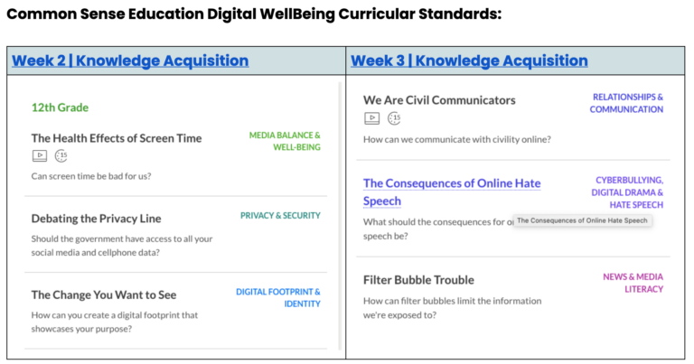
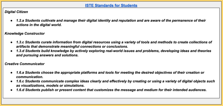
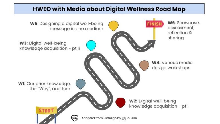
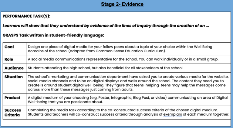
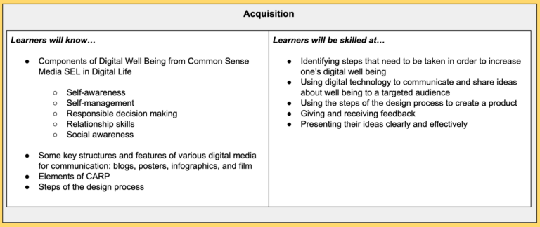
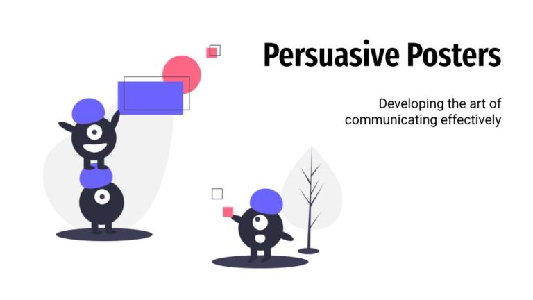
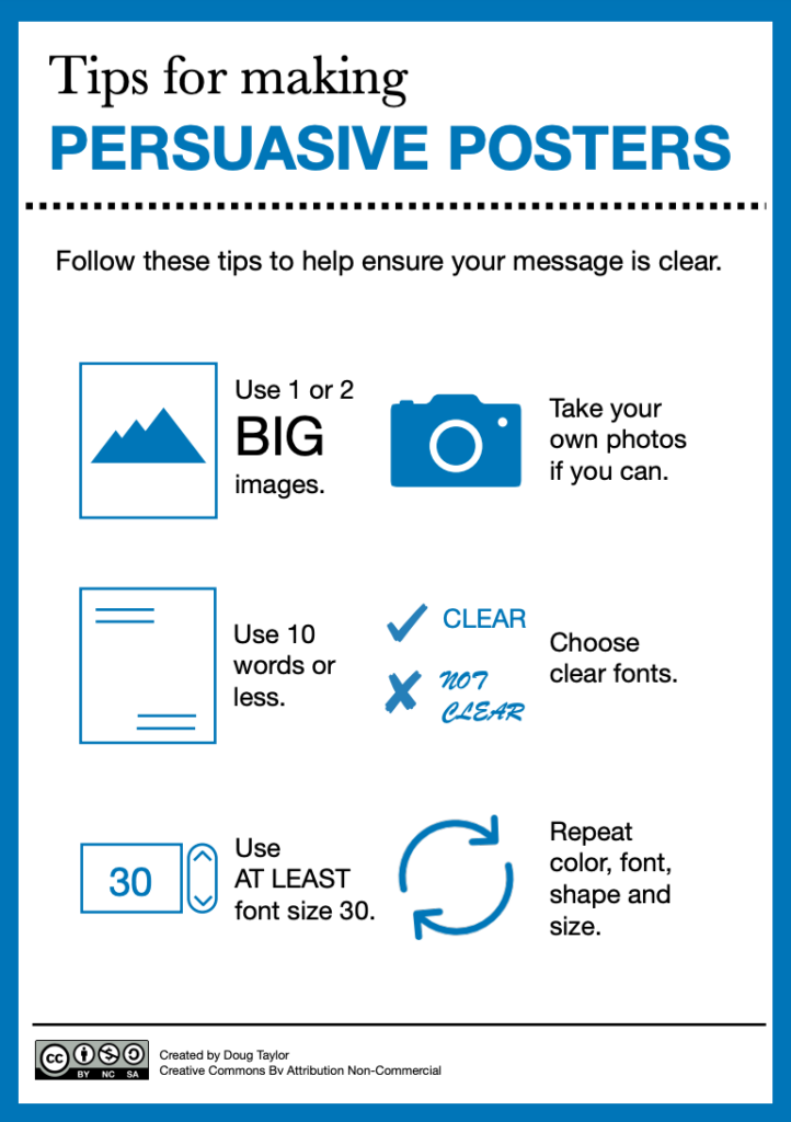
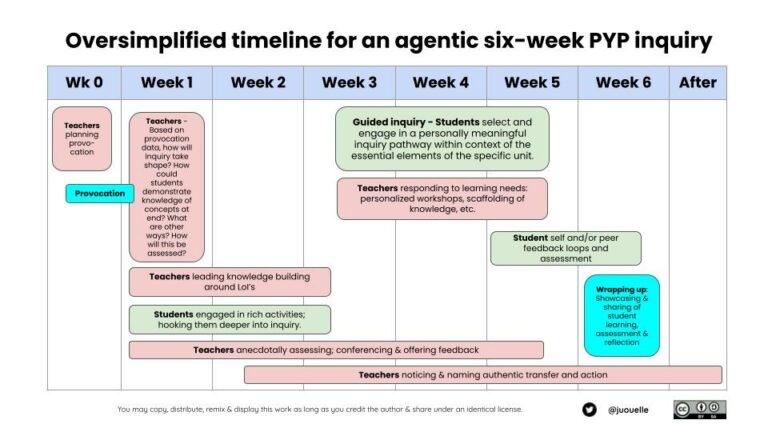
COETAIL course three’s summative task was to collaborate in a global group with my fellow cohort. I chose to collaborate with David Berg, Danielle Richert, and Megan Vosk once again since our last experience as a group went along so swimmingly. We could choose to design a unit of instruction or a professional learning experience for educators. Our group chose the former since we did the latter in a previous COETAIL project. As a group, we decided on a social-emotional well-being unit (SEL) from a digital device perspective, since it was ever so topical to our time, particularly highlighted from the pandemic. For curricular standards, we chose those from Common Sense Education for the SEL component and the ISTE Standards for Students for much of the rest. The unit itself is six weeks long. Below is the overview, or map (adapted by yours truly from Slidesgo), of the unit which will be shared with all stakeholders, along with the GRASPS statement As for any unit, it’s also important to articulate the knowledge, understanding, questions and transferable skills that go beyond the unit In week four of the unit we designed, communicated in the road map above, students attend workshops learning about various media in which they could communicate their message for their summative task effectively. Week four is what our group decided to focus on expanding our talents and skills on, as this related the most to our learning in course three of #COETAIL13. I chose to design a workshop on creating persuasive posters using CARP design principles. You can explore the slide deck here. Some COETAIL specific reflection questions… How did you grow as a collaborator and facilitator during Course 3? I think refinement and consolidation are the correct words to describe my growth here. Or working towards mastery? Whether it be work or study, I’ve been doing this for years. Some of the most transformational growth in this area was when I was studying online for five years, globally collaborating with my cohort, in order to complete my Master’s in Educational Technology from the University of British Columbia (UBC-MET). How was this final project similar to other learning experiences you have designed/facilitated? These would be my top tips for effective global collaboration:
How does this final project relate to what you learned in Course 3? This project encompasses much of the learning in regards to effective communication and consideration of audience learnt in course three. When something learnt is asked to be taught, it adds a whole new dimension of comprehension. The content needs to be well understood in order to synthesize it and communicate it effectively to a potential new audience. This is an important notion to remember as an educator. Albert Einstein was on to something here… What has influenced you the most in Course 3 and how is that reflected in your final project? For me, it is the reminder that “less is more”, when it comes to communication, regardless of audience or medium. Creative communication has a lot to do with simplicity, synthesis and the power of visuals. Some final food for thought to ponder… Would you rather…
0 Comments
This week’s topic for COETAIL, course 3, was on diversity, equity, inclusion and justice (#DEIJ). There were some great media to imbibe in, and yes, a protocol. The standout literature was Harro’s Cycle of Socialization. Connections Something that really stood out to me in Harro’s Cycle is the social and institutional indoctrination piece. We’re born curious and open-minded, yet our moral compass is shaped by those who raise us along with the social and cultural aspects of indoctrination. Sadly, many humans on our planet remain ignorant, in their comfort zone, and in a “bubble”. This narrow-minded behaviour is almost predictably resilient to change. Ignorance is not bliss, however. I’m a white male from a middle-class upbringing. It is my utmost responsibility to check my privilege. ALL. THE. TIME! Flipgrid: Our Sharing Tool Using the Text Rendering Protocol (NSRF), my #COETAIL13 cohort and I responded to Harros’ text in Flipgrid, which was a very effective use of educational technology for this purpose. Check out the responses, here. I really do love Flipgrid; been using it for years. Here are some ways I’ve used it in my practice:
Indoctrination: Changing the educational piece As educators, shaping and molding the minds of tomorrow, here are some guiding questions and/or precepts:
DEIJ – Who are some leaders in this area? I love the risk-takers who advocate and are extremely passionate about DEIJ. This list could be quite exhaustive, but here are four standout people:
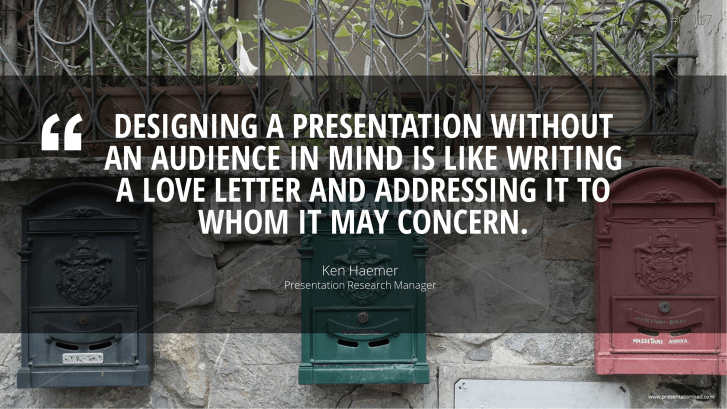
Challenging perspective/privilege This is a MUST, too! In order to challenge and disrupt my social, cultural and institutional upbringing, I’m always reading and “collecting” resources on this topic. Sharing is caring; here is my Wakelet on the topic of DEIJ. If you have any great resources you could share, please do! Audience. Audience. Do you know your … audience? When you’re crafting your message within a medium, how deeply is the audience considered? This message was at the heart of our focus for our learning this week for COETAIL course 3, week 4. Less is more The content and readings always led to this guiding precept – less is more when presenting media to an audience. Some key takeaways:
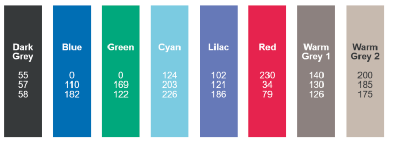
The task To ground our learning in authenticity, we were asked to redesign a piece of media and seek out feedback to improve it. Recently, I was asked to co-lead a keynote for an upcoming conference within the organization that owns my school. Thus, the slide deck presentation will be the example I will talk through below. The beginning The conference’s theme, in a nutshell, is about purposeful EdTech integration. After meeting with my co-presenter and a key organizer from corporate last week, we began our rough brainstorm. More meetings – more clarity This week, a more pivotal meeting was held with the majority of presenters and organizers. The meeting offered us a few more guiding directives from the corporation, giving more ideas and direction. This led to the design of an initial slide deck. Whilst it’s important, at this stage, to flesh out your thoughts in what you wish to communicate, you must remember not to leave the slides this way. Thankfully, my co-lead and I are no strangers to these lessons. The pictures below illustrate our “fleshing out” of ideas, yet we both knew that the slides were in definite need of some “design love”. Style guide: We asked – they delivered! Since this was a more corporate-level conference, my co-lead and I wanted to be sure that our communicative message fit the marketing style of the company’s brand. Our audience is the educators working within schools guided by the mission and vision of this company. The organization’s lead for this conference provided this style guide below, which was extremely helpful. Moving forward in collaboration My presentation partner and I decided to design in Google Slides. The medium makes it simple to not only design in a way to offer maximum creative freedom, but it also offers some key features tailored well to this task. Best “fit” features of Google Slides for this task:
After a very productive week, and several feedback loops, my partner and I are getting closer to a finished product. Final reflections To be honest, the readings this week weren’t anything new to me. That is, however, where I am after decades of lifelong learning. Some of these learning experiences include a Master’s in Educational Technology, several certifications and countless collaborative learning conferences. I do respect that many may not be there yet, in terms of their knowledge and understanding of this timeless concept. The resources shared this week did review some excellent tips and guiding principles. More on style guides Did you know that most media is designed with about five to seven colours, black and white included? Here are some of my favourite tips and resources when designing:
How about you, dear reader?
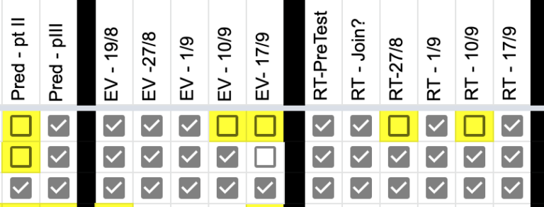
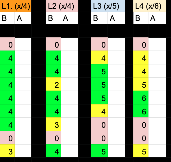
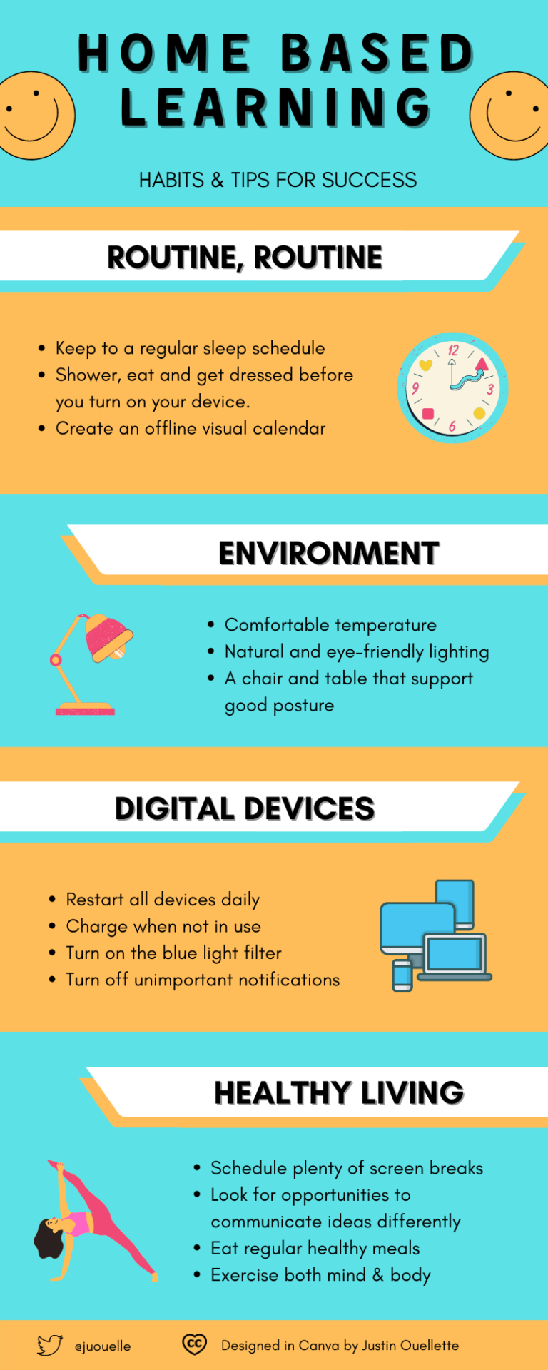
“Data will talk to you if you’re willing to listen to it.” — Jim Bergeson As I embark upon the halfway point in course three, week three, of my COETAIL journey, this week was all about data storytelling. In other words, making sense of it all, making it visual, then telling a story with it. As an educator, this is quite an important skill to develop. We’re always collecting data (or at least I am). The ability to make connections and illuminate the facts both visually and creatively is something I tend to geek out on. Personal Strategy One – Tracking feedback loops and submissions One strategy I use often is a colour coding system. In this example, I track assignment submission and feedback in Google Sheets. Yellow symbolizes students who are in feedback loops. White means that I’m still awaiting submission and needs follow-up. With the data represented this way, I know who still I need to follow up with. If I see too many yellow boxes for one assignment, it also tells me that I need to go back and re-design the assignment to make it more accessible for all and revisit the success criteria with my students. Personal Strategy Two – Assessment Traffic Lights When the data is more objective, such as in maths, I organize it on a traffic light system. What you see above is four learning objectives for a maths unit. “B” means before, or prior knowledge from the pre-assessment, and “A” means after from the post-assessment, which has not been administered yet in the above example. The colours help me personalize my math instruction. Those green students in the pre-assessment will get more challenge-based tasks and work mostly independently in small collaborative groups. Yellow get some direct instruction; after close monitoring and anecdotal observations, I may send them off to work independently in small groups on some questions and tasks. Red students get more support and direct instruction from teachers. If many children are red in a specific learning objective, it informs me that I need to spend a bit more time in that area. Once the summative assessment is done, the colours inform individual growth and next steps, and perhaps some learning objectives that need further revisiting. With the data represented this way, communicating strengths, growth and next steps for reporting is super simple. COETAIL Course Task | Design an Infographic We were asked to create an infographic as part of this week’s assignment. Since parent, teacher and student conferences are quickly approaching, and my current teaching context is home-based, I figured it would be highly purposeful and authentic to design an infographic about some strategies my learners and I discuss often to be successful each day. This visual can be presented to my students, as well as serve as a great visual to share at the conferences. My team and other colleagues within my school may benefit from this visual, too. In addition, I also thought the wider community may find it purposeful, so I decided to add a Creative Commons license to my work that would suit this. Some COETAIL reflection questions — answered
Some questions for you, dear reader!
Before you go, have you snapped up a Canva educator account?
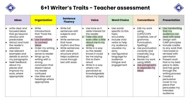
When it comes to collaboration, be more John Spencer. Every time I watch his “7 Keys to Creative Collaboration“, all I have to say whilst watching it is YES. YES. And did I say, “YASSSSS!”? Candour. Spending time together. Being vulnerable. Admitting mistakes. Letting go. Structures. All crucial to the recipe leading to empowerment and creativity in successful collaboration. Structure… funny that Many people these days love a protocol. I think there’s a time and a place for them, sure. But I do think some people/organizations tend to overdo them. Think my point here is to have some structure, but be sure there’s enough room for voice and choice within that in order to empower, rather than disengage. I do find some protocols very draconian and disempowering. Unauthentic, if you will. When anything is overdone (see unbalanced), that’s when things start to get cringe-worthy. So be more like John Spencer; those seven ingredients posited in his video are quite a winning recipe in my honest opinion. The Collaborative Task As part of my #COETAIL learning this week in course three, we did an inquiry into collaboration. In addition, we were asked to reflect on a recent collaborative activity that we recently led, or have had a part in. So here it goes… Setting the Context I teach in a grade 4 context; “Studio 4”, to be exact. I also lead a team of five other homeroom teachers, three teacher’s assistants, and liaise with three other specialist teachers (EAL, enrichment, and learning support). That’s a lot of collaboration across a very culturally diverse team. Our context for learning is online at the moment. Our beautiful city, Ho Chi Minh, has been pretty hard hit by the Delta variant. My team and I love structures, too. In addition, guided inquiry also needs structures (although it may not always be this linear). Currently, our students are writing personal narratives, which has a nice fit with our current inquiry into “Who we are”. Students are inquiring into “Who they are” as writers, readers, inquirers and more. Goal setting As teachers, we empower our students to set goals. This aligns nicely with ISTE Empowered Learner standard indicator 1a. Here are some ways we plan to do this for writing:
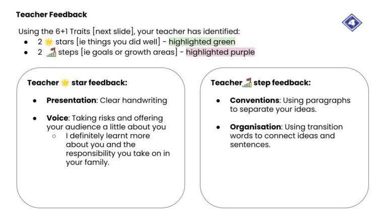
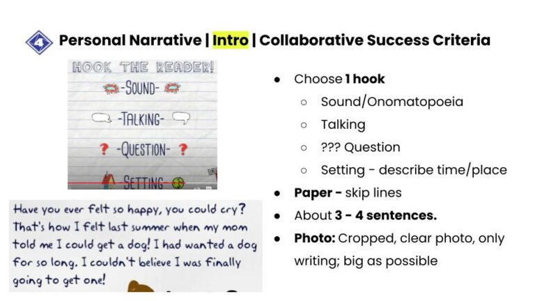
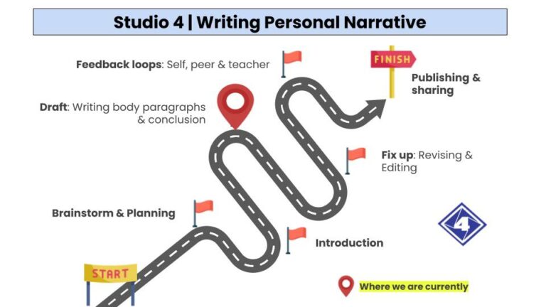
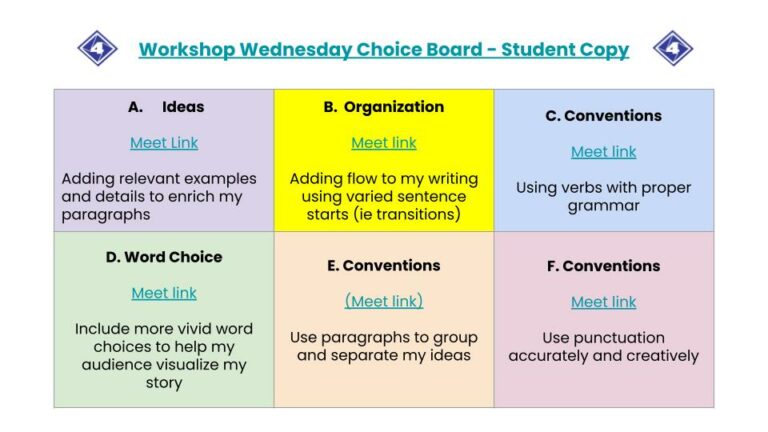
Co-constructing Success Criteria Now that the stage was set, we’ve been working on our personal narrative drafts, co-constructing our success criteria for each stage, collaboratively. This leads to further motivation and empowerment. A shared vision of success from the voices of the community. Co-creating a Shared Roadmap – The Journey & The Destination It’s important, in any big project or inquiry, that backwards design is a part of the plan. This is a productive “structure” essential for collaboration. The “race” is personalized. But it’s crucial that each learner knows where their personalized writing journey begins and ends. Even better when there’s a visual. Writer’s Workshop Wednesday Part of what my team and I collaboratively have designed, as part of our writing “structure”, is at least two rounds of “Writer’s Workshop” in every major piece of writing. We follow it up with a “Transfer Thursday” where learners inject their newly acquired skills directly into their respective projects the next day. How does it all work? Since this was our first round of “Writer’s Workshops”, this is how my team and I collaborated, and some of the structures we used:
Overall, the day was truly empowering for both teachers and students alike. The next day, students engaged in “Transfer Thursdays” and revised and edited their work with their new skills, while they were fresh. Essentially, adding that layer of authenticity to the skill. This was just writing. Final thoughts on Collaboration We’re called “Studio 4” in what would traditionally be called “Grade 4”. Workshops and cross-collaboration are key ingredients to what makes our community a Studio. As a collaborative team, we look for golden opportunities like these as often as possible. As a school, this is our guiding precept: “It takes a village to raise a child.” – African proverb Collaboration Curiosity
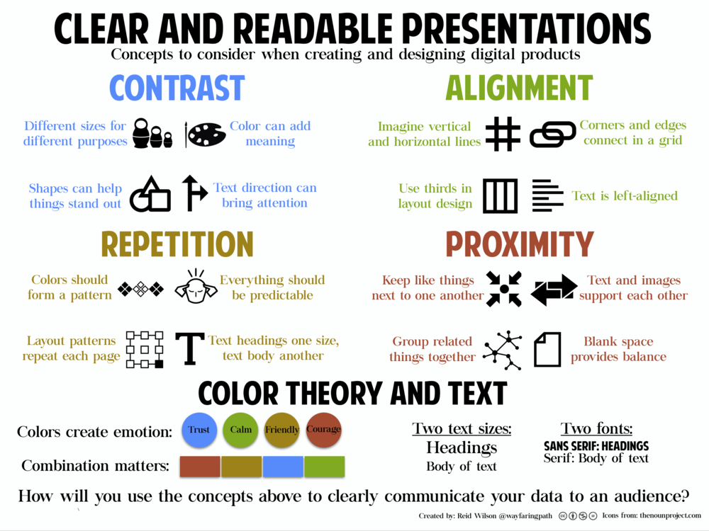
New course, new school year, new job changes… This week, COETAIL course 3 kicked off with a focus on intentional design. After going through the excellent readings shared, I’d say most things consolidated my beliefs and practices on this topic. Below are some skills posited in the readings that I practice regularly, and actively teach with my children. Contrast – Alignment – Repetition – and Proximity [CARP] I remember first being introduced to this by Keri-Lee Beasley in her workshop at a Learning 2 Conference in Manilla some years back. It really struck a chord with me. CARP is always at the front and center of whatever content I produce and I am often teaching these concepts in small doses or in workshops with my kids. Here’s a great visual on the topic created by a former COETAIL-er, Reid Wilson. Thoughtful Organization Chunking, small snippets of ideas, small lists, sub-headings, space … Generally speaking, if we can group our ideas into 5 or less synthesized and salient arguments towards one very central and focused topic, that’s a winning recipe to a successful post, in my opinion. Less is more A quick search on Google for word limits in a blog post suggests that 2,000 or less should be your target. I’d argue no more than 1,000. If you’re running over that, think of how you could separate your ideas into two more digestible posts. As human attention spans keep reducing to less than that of a goldfish, this is great food for thought for intentional curation of your content. Leave your audience with some takeaways I like to mix it up with any combination of the following…
Intentional Design Reflection: What are my goals? What could I do better?
Some further takeaways on this topic
A leaving favour to ask of you!
Design is intelligence made visual.” – Alina Wheeler, Author |









 RSS Feed
