|
Audience. Audience. Do you know your … audience? When you’re crafting your message within a medium, how deeply is the audience considered? This message was at the heart of our focus for our learning this week for COETAIL course 3, week 4. Less is more The content and readings always led to this guiding precept – less is more when presenting media to an audience. Some key takeaways:
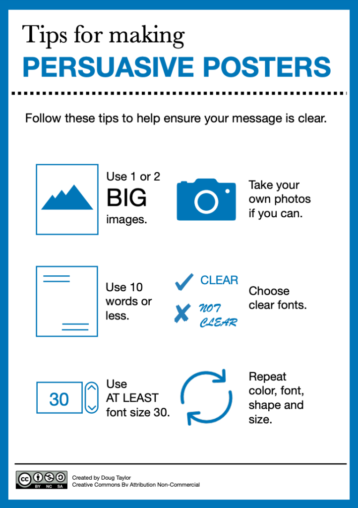
The task To ground our learning in authenticity, we were asked to redesign a piece of media and seek out feedback to improve it. Recently, I was asked to co-lead a keynote for an upcoming conference within the organization that owns my school. Thus, the slide deck presentation will be the example I will talk through below. The beginning The conference’s theme, in a nutshell, is about purposeful EdTech integration. After meeting with my co-presenter and a key organizer from corporate last week, we began our rough brainstorm.   More meetings – more clarity This week, a more pivotal meeting was held with the majority of presenters and organizers. The meeting offered us a few more guiding directives from the corporation, giving more ideas and direction. This led to the design of an initial slide deck. Whilst it’s important, at this stage, to flesh out your thoughts in what you wish to communicate, you must remember not to leave the slides this way. Thankfully, my co-lead and I are no strangers to these lessons. The pictures below illustrate our “fleshing out” of ideas, yet we both knew that the slides were in definite need of some “design love”.   Style guide: We asked – they delivered! Since this was a more corporate-level conference, my co-lead and I wanted to be sure that our communicative message fit the marketing style of the company’s brand. Our audience is the educators working within schools guided by the mission and vision of this company. The organization’s lead for this conference provided this style guide below, which was extremely helpful. 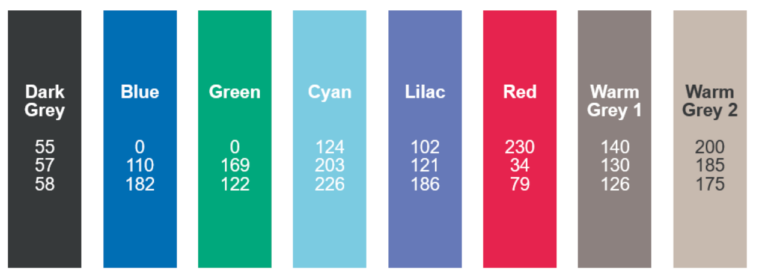 Moving forward in collaboration My presentation partner and I decided to design in Google Slides. The medium makes it simple to not only design in a way to offer maximum creative freedom, but it also offers some key features tailored well to this task. Best “fit” features of Google Slides for this task:
After a very productive week, and several feedback loops, my partner and I are getting closer to a finished product. Final reflections To be honest, the readings this week weren’t anything new to me. That is, however, where I am after decades of lifelong learning. Some of these learning experiences include a Master’s in Educational Technology, several certifications and countless collaborative learning conferences. I do respect that many may not be there yet, in terms of their knowledge and understanding of this timeless concept. The resources shared this week did review some excellent tips and guiding principles. More on style guides Did you know that most media is designed with about five to seven colours, black and white included? Here are some of my favourite tips and resources when designing:
 How about you, dear reader?
0 Comments
Leave a Reply. |
 RSS Feed
