“Data will talk to you if you’re willing to listen to it.” — Jim Bergeson As I embark upon the halfway point in course three, week three, of my COETAIL journey, this week was all about data storytelling. In other words, making sense of it all, making it visual, then telling a story with it. As an educator, this is quite an important skill to develop. We’re always collecting data (or at least I am). The ability to make connections and illuminate the facts both visually and creatively is something I tend to geek out on. Personal Strategy One – Tracking feedback loops and submissions One strategy I use often is a colour coding system. In this example, I track assignment submission and feedback in Google Sheets. Yellow symbolizes students who are in feedback loops. 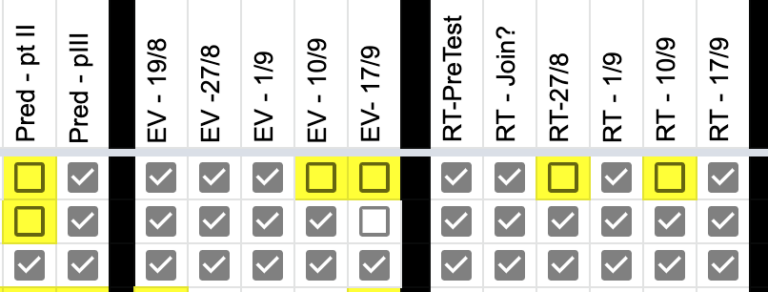 White means that I’m still awaiting submission and needs follow-up. With the data represented this way, I know who still I need to follow up with. If I see too many yellow boxes for one assignment, it also tells me that I need to go back and re-design the assignment to make it more accessible for all and revisit the success criteria with my students. Personal Strategy Two – Assessment Traffic Lights When the data is more objective, such as in maths, I organize it on a traffic light system. 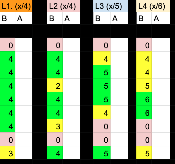 What you see above is four learning objectives for a maths unit. “B” means before, or prior knowledge from the pre-assessment, and “A” means after from the post-assessment, which has not been administered yet in the above example. The colours help me personalize my math instruction. Those green students in the pre-assessment will get more challenge-based tasks and work mostly independently in small collaborative groups. Yellow get some direct instruction; after close monitoring and anecdotal observations, I may send them off to work independently in small groups on some questions and tasks. Red students get more support and direct instruction from teachers. If many children are red in a specific learning objective, it informs me that I need to spend a bit more time in that area. Once the summative assessment is done, the colours inform individual growth and next steps, and perhaps some learning objectives that need further revisiting. With the data represented this way, communicating strengths, growth and next steps for reporting is super simple. COETAIL Course Task | Design an Infographic We were asked to create an infographic as part of this week’s assignment. Since parent, teacher and student conferences are quickly approaching, and my current teaching context is home-based, I figured it would be highly purposeful and authentic to design an infographic about some strategies my learners and I discuss often to be successful each day. This visual can be presented to my students, as well as serve as a great visual to share at the conferences. My team and other colleagues within my school may benefit from this visual, too. In addition, I also thought the wider community may find it purposeful, so I decided to add a Creative Commons license to my work that would suit this. 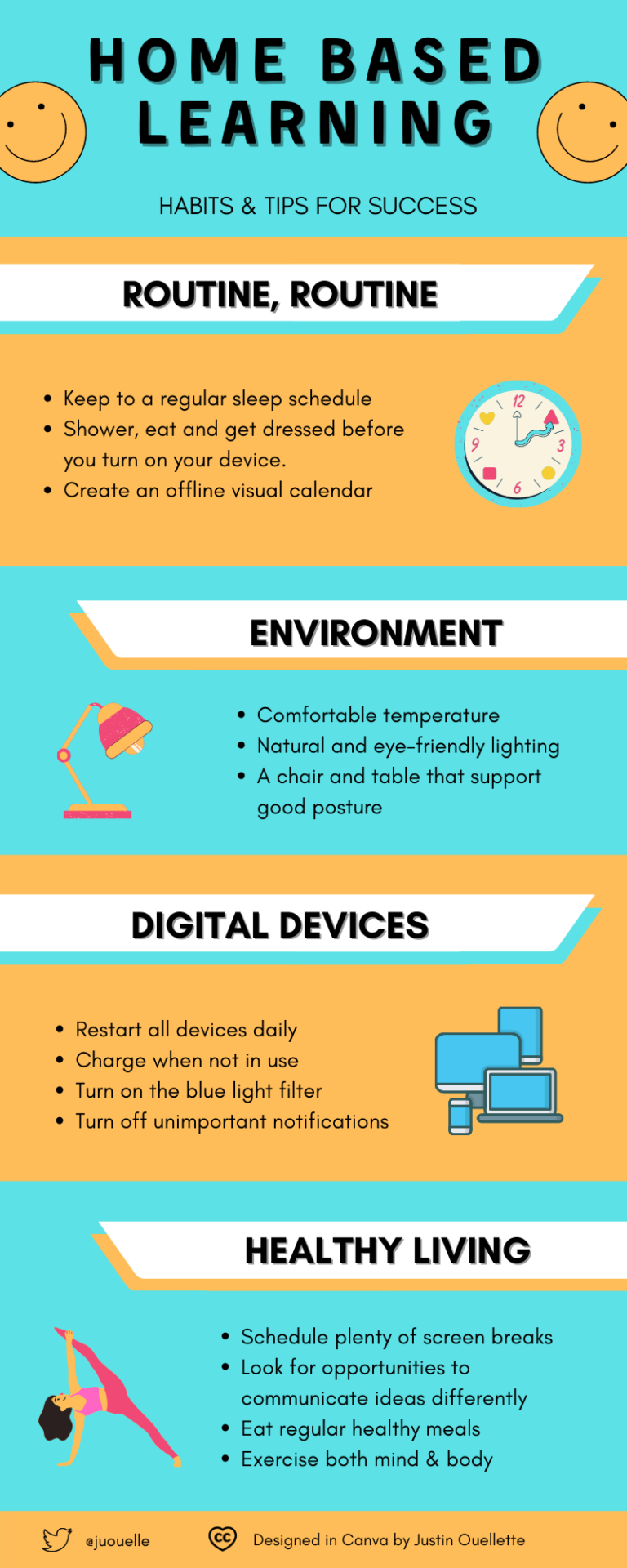 Some COETAIL reflection questions — answered
Some questions for you, dear reader!
Before you go, have you snapped up a Canva educator account?
0 Comments
Leave a Reply. |
 RSS Feed
